Part 1
A dot is on or it is off. The first graphical computers worked with nothing else.
In 1984 the Macintosh shipped with a screen of 512 by 342 dots, and each dot was black or white. There was no grey to lean on. Susan Kare, who drew its first icons, sketched them on graph paper, where a mistake was one square wide and plain to see.
A limit like that sets the terms of the drawing. A 32 by 32 icon has about a thousand squares to spend, so every square has to earn its place. Take one away and a handle goes. Add one and a clean edge looks dirty.
512 by 342 dots at one bit each comes to 21,888 bytes. The first Macintosh had 128 kilobytes of memory, so the picture alone took about a sixth of it.
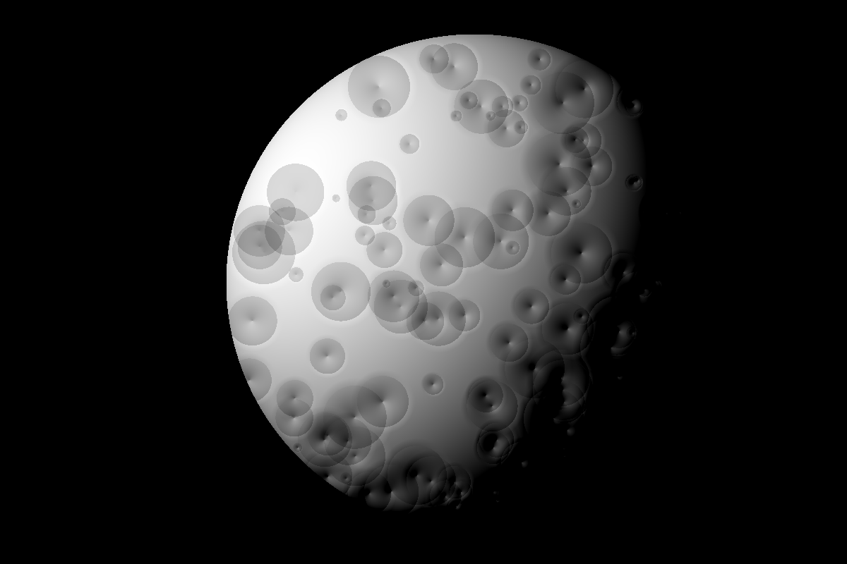
A rendered sphere with one light, filtered with a 4 by 4 ordered dither. Drag to change how many dots it gets across.
A plasma panel of 512 by 512 orange dots, built for teaching at the University of Illinois. The display kept its own image, with no memory needed to refresh it.
A portrait screen of 606 by 808 dots, close to a sheet of paper. It was a research machine and was never sold as a product.
The Macintosh's expensive older sibling. It had a graphical desktop, a mouse and a price of about ten thousand dollars.
MacPaint, written by Bill Atkinson, came with the Macintosh in 1984. On a black and white screen it could not offer colours, so its palette was a row of small repeating patterns: dots, bricks, weaves and diagonals.
The patterns did the job of colour and of tone. People filled shirts with one and skies with another. A whole visual style came from a list of 8 by 8 tiles.
Drawn for this page. Twelve rows, two values, and a shape anyone can read. Removing the corner dots from the top is what makes it soft.
Drawn for this page. The two notches are the only detail, and they do all the work of saying key.
HyperCard arrived on the Macintosh in 1987, also from Bill Atkinson. It stored information as stacks of black and white cards with buttons that jumped between them, and it let people with no training build software.
The game Myst began as a HyperCard stack in 1993. Its early versions showed what a careful artist could do by pressing the tool beyond what it was meant for.
Part 2
With two values, tone has to be faked. There are many ways of faking it, and each leaves its own marks.
Scatter dots more or less thickly and the eye averages them into tone. Newspapers worked this out long before computers did. In 1880 the New York Daily Graphic printed a photograph of a shanty town as a halftone, a pattern of dots of differing sizes.
Screens cannot grow a dot, so they change how many dots are on in an area. That process is called dithering, a word taken from an old term for trembling.

A smooth greyscale ramp from left to right. Nothing else in this issue shows a dither pattern as plainly.
In 1973 Bryce Bayer published a way of ordering thresholds so that dots switch on as evenly as possible. Each dot compares its light with one cell from a small repeating grid of numbers.
The method needs no memory of its neighbours, which made it cheap and fast. It also never shimmers in a moving picture, because each pixel always uses the same threshold.
| Row | Column 1 | Column 2 | Column 3 | Column 4 |
|---|---|---|---|---|
| 1 | 0 | 8 | 2 | 10 |
| 2 | 12 | 4 | 14 | 6 |
| 3 | 3 | 11 | 1 | 9 |
| 4 | 15 | 7 | 13 | 5 |
Divide each value by 16 to get a threshold. A dot lights if its brightness is above the value for its place in the grid. This zine uses this same table.
In 1976 Robert Floyd and Louis Steinberg published a different idea. Round each dot to black or white, then share the rounding error among the neighbours still to be drawn.
No grid repeats, so images look more natural and detail survives better. The cost is that one changed pixel can alter everything drawn after it, which makes moving pictures crawl.
| Method | Year | Neighbours | Error passed on |
|---|---|---|---|
| Floyd and Steinberg | 1976 | 4 | All of it |
| Jarvis, Judice and Ninke | 1976 | 12 | All of it |
| Stucki | 1981 | 12 | All of it |
| Atkinson | 1980s | 6 | Three quarters |
Bill Atkinson's dither for the Macintosh passes on only three quarters of the error. The rest is simply discarded.
This loses detail in the darkest and lightest areas, which turn to solid black or white. On a small screen that is often an improvement, because the image gains contrast and looks crisper.
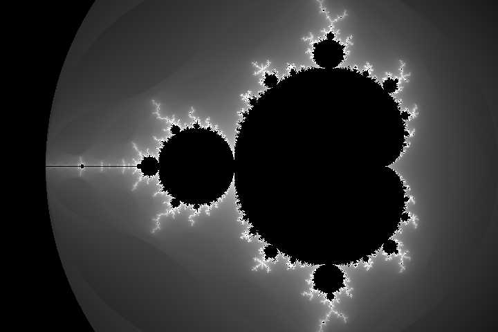
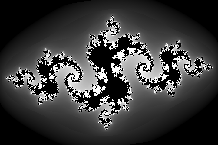
A Julia set, computed for this page and filtered with a Bayer matrix. Fine filaments are the first thing a low dot count loses.
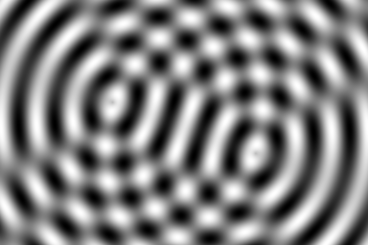
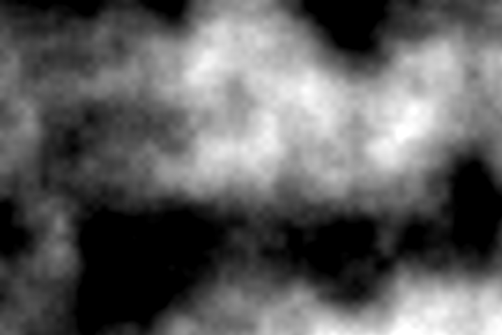
Two sets of circular waves added together. At low dot counts, the dither grid and the wave rings create new patterns of their own.
Robert Ulichney's 1987 book Digital Halftoning described what makes a dither look good. The best patterns have little low frequency content, so the eye reads them as texture and not as shapes.
He called this blue noise, by analogy with blue light, which sits at the high frequency end of the spectrum. It is now common in film and game rendering, where it hides the noise of sampling.
Part 3
Before screens could draw freely, they could only spell. Pictures were made from whatever was in the font.
In 1928 IBM introduced a punched card with 80 columns. Businesses built their records around it, and when terminals replaced card readers, they kept the width so that the old records would still fit.
The VT100 terminal of 1978 showed 80 columns by 24 rows. Many command lines still open at that size today, a century after the card.
| Machine | Year | Columns | Rows |
|---|---|---|---|
| IBM 3270 terminal | 1971 | 80 | 24 |
| Apple II | 1977 | 40 | 24 |
| VT100 | 1978 | 80 | 24 |
| IBM PC, colour text | 1981 | 80 | 25 |
| Commodore 64 | 1982 | 40 | 25 |
Seven bits give 128 codes. ASCII was published in 1963, and it spent 33 of them on control signals for machines such as teleprinters.
The IBM PC of 1981 used all eight bits. The extra 128 characters included accents, Greek letters, shaded blocks and line pieces, and these became a drawing kit.
The BBC's Ceefax began in 1974 and ran until 2012. It sent pages of 40 characters by 24 rows hidden in the broadcast TV signal, and the viewer's set picked out the page they wanted.
Each character cell could also be a block mosaic of 2 by 3 squares. With those, teletext artists drew weather maps, logos and the odd rabbit. The pages arrived in a loop, so a viewer sometimes had to wait for one to come round.
Each 2 by 3 cell can be any of 64 shapes. Pictures were built from these, and each row of the page was limited in its colours.
France gave out terminals in place of paper phone books. Services ran until 2012, three decades later.
Often counted as the first bulletin board system. It was built in Chicago during a snowstorm.
Groups on bulletin boards drew with shaded blocks and 16 colours. Packs of the work were released monthly.
Typists made pictures long before computers did. Flora Stacey's butterfly, built on a typewriter, was published in 1898.
On computers, ASCII art grew up around printers and early networks. The smiley :-) is usually dated to a message Scott Fahlman posted at Carnegie Mellon in 1982. It may be the most used low resolution drawing there is.
Part 4
Memory was the scarcest thing in a home computer. Graphics hardware was designed around having too little of it.
The console of 1977 had no memory for a picture at all. Programs had to change the graphics registers as the TV beam moved down the screen, and this was called racing the beam.
Macintosh
C64
ZX Spectrum
Game Boy
The Apple II is left out of the drawing because at 280 by 192 it would sit almost exactly on the Spectrum.
| Machine | Year | Dots | Total | Colours |
|---|---|---|---|---|
| Apple II, high resolution | 1977 | 280 × 192 | 53,760 | 6 |
| ZX Spectrum | 1982 | 256 × 192 | 49,152 | 15 |
| Commodore 64 | 1982 | 320 × 200 | 64,000 | 16 |
| Macintosh | 1984 | 512 × 342 | 175,104 | 2 |
| Game Boy | 1989 | 160 × 144 | 23,040 | 4 |
The ZX Spectrum stored its picture in two parts. A bitmap of 6,144 bytes said which dots were on, and 768 bytes of attributes gave each 8 by 8 cell just two colours.
That left 6,912 bytes in total, which was cheap. When a character walked across a cell, though, its colour bled into the scenery. Spectrum artists often gave up and drew their games in one colour, or used thick outlines to hide the effect.
6,144 bytes of dots plus 768 bytes of colour. The screen took more than a third of a 16K machine's memory.
A sprite is a small image the hardware draws on top of the background, with no need to change the picture stored in memory. The Commodore 64 had eight of them, each 24 by 21 dots.
Programmers soon learned to move a sprite after it had been drawn, so that it could be used again lower down the screen. Rules like eight sprites were more of a starting offer.
| Standard | Year | Dots | Colours |
|---|---|---|---|
| CGA | 1981 | 320 × 200 | 4 |
| CGA, high resolution | 1981 | 640 × 200 | 2 |
| Hercules | 1982 | 720 × 348 | 2 |
| EGA | 1984 | 640 × 350 | 16 of 64 |
| VGA | 1987 | 320 × 200 | 256 |
The hero of Donkey Kong, in 1981, was only 16 dots tall. As the story is often told, Shigeru Miyamoto gave him a moustache because a mouth would not show, and a cap because hair was hard to draw and animate.
Whether or not every detail is exact, the point holds. Some of the most recognised characters in the world look the way they do because of the size of a grid.
Drawn for this page, in the manner of the time. It is not any particular character. A cap and a moustache take about twelve dots.
The picture is built from 8 by 8 tiles, each with up to four colours.
It can show 64 sprites at a time.
Only 8 sprites fit on a line. Any more and they flicker or vanish, which is why games blink.
Part 5
Batteries added a new limit. Every bright pixel cost power, and most of the screens were tiny.
Gunpei Yokoi, who led the team behind the Game Boy, had a phrase for his method: lateral thinking with withered technology. He used old parts, well understood and cheap, in ways nobody had tried.
The Game Boy of 1989 had a screen of 160 by 144 dots in four shades with no backlight. Its rivals had colour, but they burned through batteries. The Game Boy won.
Virtual Boy
Palm Pilot
Game Boy
TI-83
Nokia 3310
Drawn to one scale, by dots and not by physical size.
| Machine | Year | Dots | Tones |
|---|---|---|---|
| Game Boy | 1989 | 160 × 144 | 4 shades |
| Atari Lynx | 1989 | 160 × 102 | 16 at once |
| Game Gear | 1990 | 160 × 144 | 32 at once |
| Virtual Boy | 1995 | 384 × 224 | Red only |
| Tamagotchi | 1996 | 32 × 16 | 2 |
| Nokia 3310 | 2000 | 84 × 48 | 2 |
4,032 dots, and it still held a menu system, messages and a game. Most people who owned one could describe the screen from memory.
Taneli Armanto put Snake on the Nokia 6110 in 1997. The game needs only a grid, a line and a dot, so a phone with almost no graphics could run it.
Because a snake is made of the same square as its food and its walls, the game looks correct at any resolution. It is a good example of a design shaped to its screen and not squeezed on to it.
Drawn for this page: a body, a turn and a dot to chase. That is the full set of graphics the game requires.
Shades of green-grey on a screen with no backlight. Playing after dark meant finding a lamp.
A pet with a whole personality on 512 dots. Forty million or so were sold within a few years.
Issued for maths classes, and home to a long line of games written under the desk.
The Virtual Boy of 1995 used a single column of red LEDs and a vibrating mirror to paint each eye's picture, 384 by 224 dots at a time.
Red LEDs were the cheap, efficient choice at the time. The console lasted less than a year on sale, and it remains one of Nintendo's few real failures. It is also one of the strangest displays ever put in a shop.
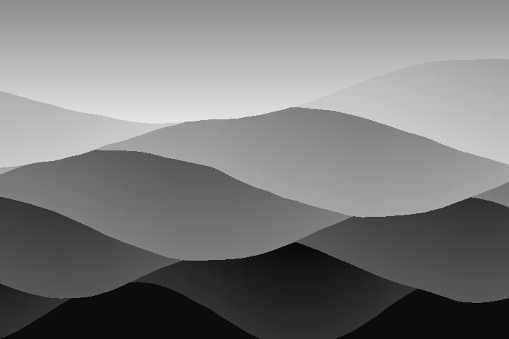
Layered ridges, generated for this page. Few tones and strong shapes are what work best on a small two-value screen.
Part 6
Type is the hardest test of a coarse screen. Curves are guesses, and every letter has to be decided by hand.
35 dots is about the least you can give a Latin letter and keep the whole alphabet easy to read. It held on for decades in printers, lift displays and cash tills.
One of the 35 dot grids. Diagonals are the hard part, and here the leg is three separate steps.
In 1967 the Dutch designer Wim Crouwel proposed a typeface for cathode ray tubes, which at the time drew type badly. He dropped diagonals and curves altogether.
Some letters can only be told apart by context, and he knew it. It was meant as a provocation more than as a tool. Decades later, it reads as a prediction of what screens would make of type.
OCR-A, from the 1960s, was drawn so a machine could read it, on a grid of strokes. In 1968 Adrian Frutiger designed OCR-B, which tried to make the same machine reading comfortable for people too.
Both survive on bank documents and in design. Type that looks technical is often just type that was once built for a technical reason.
When the Macintosh arrived, Zuzana Licko began to draw bitmap faces for it, including Emperor, Oakland and Universal, in 1985. Rather than copy old type at a poor resolution, she treated the dots as the material itself.
Her studio, Emigre, ran these faces in its own magazine. Many people found it ugly at first, and then it became one of the most imitated looks of the period.
Matthew Carter drew Verdana and Georgia for Microsoft in 1996. The usual method was to draw an outline first and fit it to the screen later. He started with the bitmaps, and fitted the outlines round them.
This is why both remain so legible at small sizes on old screens. Wide spacing and open shapes meant that letters stayed apart at 10 dots tall.
Enough to show all ten numerals. Letters are mostly a matter of luck.
Enough for the whole alphabet, as on old pocket organisers.
The display type on these pages sits on a lattice of 4 by 6 and is drawn with one pen.
| Face | Designer | Year |
|---|---|---|
| New Alphabet | Wim Crouwel | 1967 |
| OCR-B | Adrian Frutiger | 1968 |
| Chicago | Susan Kare | 1984 |
| Oakland | Zuzana Licko | 1985 |
| Verdana | Matthew Carter | 1996 |
| Silkscreen | Jason Kottke | 1999 |
Part 7
Grids of two values were in use for centuries before any screen. People had already learned what they could do.
In 1804 Joseph Marie Jacquard showed a loom driven by a chain of punched cards. A hole raised a thread and no hole left it down. Each row of the card was a row of the cloth.
Woven portraits made this way could take tens of thousands of cards. Charles Babbage, who owned one such portrait of Jacquard himself, later planned to use the same cards to program his Analytical Engine.
Six dots, each raised or flat, give 64 combinations. Louis Braille published his system in 1829, having started on it as a teenager.
Three Braille cells side by side, each a grid of six dots. The reader takes them in with one fingertip.
Every cell of the cloth is either stitched or not. Samplers worked the alphabet in this way for hundreds of years.
Stitches come in two kinds, knit and purl. The charts are simple bitmaps.
Dots, dashes and gaps: a one-bit signal over a wire. Samuel Morse and Alfred Vail made the first version.
Photographs could not be printed with type until they were broken into dots. Glass screens ruled with fine lines did this optically, turning tones into dots of varying size.
Newsprint could only hold coarse dots, usually at around 85 lines per inch. Roy Lichtenstein later enlarged the look of cheap print dots until the dots themselves were the picture.
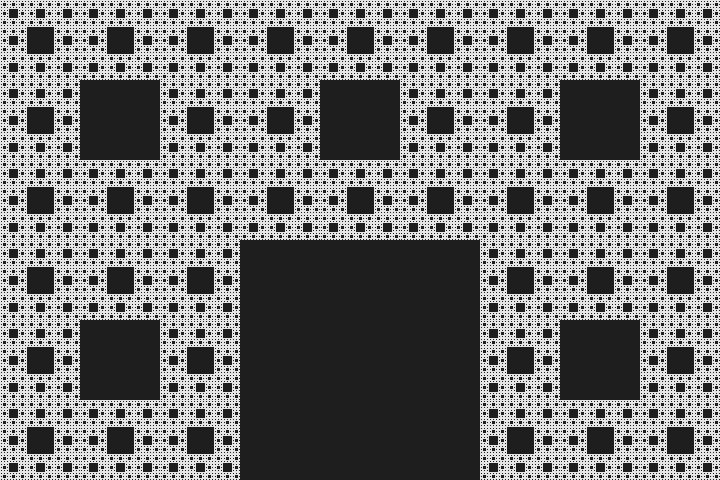
A Sierpinski carpet, computed for this page. Its holes are square, so a grid of the right size draws it perfectly and any other size does not.
Denso Wave invented the QR code in 1994 to track car parts. The smallest version is 21 by 21 squares. Any phone can now read them, so low resolution graphics are back on nearly every shop front.
They survive wear because of error correction: at the highest setting, about 30 percent of a code can be lost and it will still read.
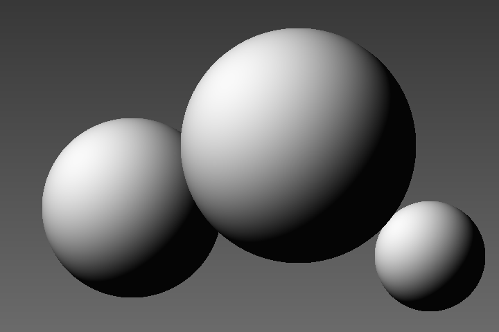
Three shaded spheres, computed for this page. The dark sides show how much a two-value image relies on the viewer to finish it.
Part 8
Nobody has to work this way now. Some people choose to, and that changes what the limit means.
3,840 by 2,160. That is 47 times the first Macintosh, and more dots than most of us can pick out.
| Screen | Year | Dots | Total |
|---|---|---|---|
| Macintosh | 1984 | 512 × 342 | 175,104 |
| VGA | 1987 | 640 × 480 | 307,200 |
| Kindle | 2007 | 600 × 800 | 480,000 |
| iPhone 4 | 2010 | 960 × 640 | 614,400 |
| 4K television | about 2013 | 3840 × 2160 | 8,294,400 |
Lucas Pope released Return of the Obra Dinn in 2018. It is a 3D mystery rendered in one-bit dither, at 640 by 360 dots. He put real work into stopping the pattern from swimming as the view turned.
A choice like that does more than look old. The limited image forces the player to look hard at faces and clothing, which is the whole of the game.
Panic released the Playdate in 2022, with a screen of 400 by 240 dots in black and white, no backlight and a crank on the side. Hundreds of developers have made games for it.
Its screen is sharp and reflective, closer to a page than to a phone. The limit is a selling point here, not a compromise.
A fantasy console from 2015 with a screen of 128 by 128 dots and 16 colours. The limits are built in and can't be turned off.
Another fantasy console, at 240 by 136 dots. It is free and open source.
A small editor for making tiny games and stories on a 128 by 128 grid, in a browser.
Electronic paper holds its picture with no power, like the plasma panel on PLATO. The first Kindle, in 2007, had four shades of grey on an E Ink screen of 600 by 800 dots.
The limits return in a new form. Each refresh is slow and costly, so designers have had to think about what changes on screen, just as they did in the 1980s.